FEATURED WORK
Lions krav Maga
Self-Defense training and conditioning
Jason and Katie Fryer are passionate practitioners and teachers of the self-defense fighting system Krav Maga that was developed by the Israeli Defense Force post World War II. They want to educate the world that Krav Maga is not only for self-defense but also a wonderful way to build strength through conditioning and, most importantly, encourage self-confidence.
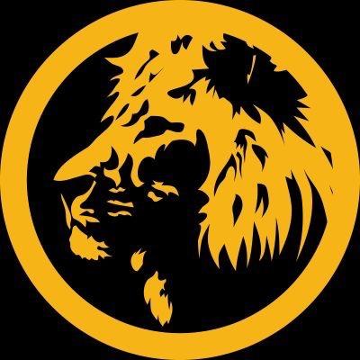
One of the major challenges for a mixed martial arts client is the perception of aggressiveness and masculinity. When Jason and Katie began developing their business, they wanted to avoid the typical perception and chose the name Lions Krav Maga because a lion is a symbol of strength, self-reliance, and confidence. Using black and yellow to illicit strength, I took an image of a stoic lion and translated it in a two-tone logo that can be used in their branding and marketing to create an impact while not being aggressive. The lion is overseeing his “pride” or, in this case, Jason and Katie’s students training to become self-reliant masters of their own jungles.
Floppy Adult
Video Games ConsulTing Firm
Video games consultant John Warren makes the joke that if he fell down he would be like a turtle flipped on its shell not able to get up; John uses a wheelchair, insisting his mobility challenges can be a marketing edge. Using his sense of humor and his company’s name Floppy Adult as inspiration, John and I began brainstorming on how to use the image of a turtle on its back as a logo for a video games consulting firm.
The introduction to video games for many people in our generation’s first introduction to video games was the retro 8-bit video game console Nintendo Entertainment System (NES) that featured low pixel-count characters called sprites. We decided that a retro turtle sprite would be the best way to encapsulate a video game centric business, invoke fond memories, and convey John’s personality and message to his clients reminding everyone that although the video games industry is hard work, the end result is meant to be fun.
falconman woodworks
custom carpentry and woodwork
I created this logo for my company that I started in 2016; I am my own client. I have always had a passion for carpentry and woodworking since I was young. My grandfather was a master carpenter and my father is an avid construction and architectural hobbyist. The main challenge was to translate my minimalist design philosophy into a logo for custom woodworking using the nonsensical Falconman Woodworks, a name derived from a joke between my best friend and I due to me misnaming a villain from the iconic video game series Mega Man.
Using retro-inspired typography and circular badge design to reflect the history of the woodworking trade, the Falconman arrow became the lynch pin to convey my company’s minimalist approach to woodworking; The arrow itself is a combination of the first letters of “Falcon” and “Man”. Using only lines, I designed the arrow to have two symbolic meanings: The shape of representing a falcon mid-flight and an arrow represent myself moving upward and forward in my career journey.
